Colour is a powerful psychological tool.
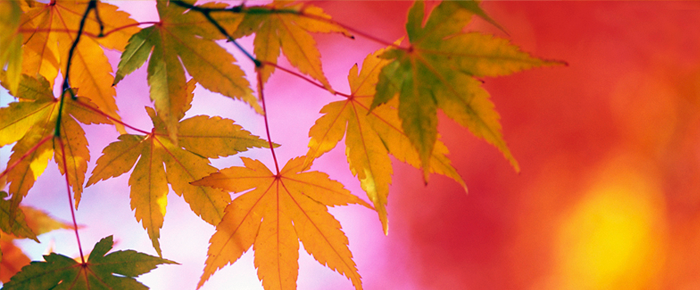

You can use colour to influence – to send a positive message or a negative one, to encourage or discourage.
I’m often asked about colour choices, when designing brands and websites.
First of all, remember that your brand is not really about your logo and the colours and fonts you choose; this is a simplistic approach to branding.
Your Brand Is About Your Values
When you use your brand to link to and reflect your values and you choose colours that reflect these, you can use colour psychology in all facets of your marketing – including logo design, website design, and the cover of your book.
When choosing colours for your brand, rather than looking simply at traditional colour wheels and which colours complement each other, instead look first at the energies carried by each colour, the archetypes they represent and the subconscious messages they carry.
Used this way, colour and the psychology behind it can become an extremely powerful marketing tool.
Key points to remember are:
- The psychology of each colour changes with different shades and hues
- Different cultures have different associations and meanings for colours
- Different age groups tend to be attracted to different colours
- Just as children prefer primary colours, the elderly prefer muted tones

Guide To The Meaning Of Colours
As with everything, there are layers and layers of meaning you can delve into.
Here is a brief overview of the psychological meaning of the core colours, to help you choose and use colours which reflect your brand values and link well to the services and products you offer and your target market.

Black
The colour of authority and power, stability and strength

- It is also associated with intelligence (degree robes)
- It is associated with death and grieving, in the west
- It can be associated with evil
- It has masculine overtones – it’s more popular with men than women
- Often used for expensive, luxury products, especially with gold
- Appears chic, especially with vivid highlight colours
- It is easy to overwhelm people with too much black
- In mythology it is associated with the underworld
White
Is associated with purity, cleanliness and clarity

- It’s also associated with innocence and youthfulness
- As well as safety and with peace
- It’s also associated with wholeness, completion and perfection
- It also conveys new beginnings and creativity
- It is often used to project neutrality
- It’s frequently used for health related products and services
- Remember that it is associated with death and mourning in eastern cultures
Grey
Suggests the timeless, reliable and the practical
- Grey also conveys intellect, detachment, neutrality and coolness
- Grey is often associated with “middle of the road”
- Some shades of grey are associated with old age, death, taxes, or depression
- Dark, charcoal greys often carry the luxury, masculine overtones of black
- Pale silver greys can also convey sophistication and elegance
- A bit of grey can add a rock solid feeling to your product image
- Too much grey can be rather dull and dingy
Silver
Is associated with the rational, scientific and modern

- As a precious metal, it is also associated with prestige and wealth
- It’s often used for science and high-tech products
- It can appear sophisticated and elegant
- It can convey giving a helping hand
- An offshoot of grey, it can also be associated with coldness
- It also has associations with the moon and feminine energies
- It is sometimes associated with the crown chakra
Red
The colour of action, passion, danger, speed and sex
- Red is the symbol of life – red blooded life!
- It is also associated with anger and with war
- Excellent for drawing attention – it works best as a highlight colour
- It’s also good for a call to action
- It is frequently used for competitive sports and fast cars
- It also has strong associations with Christmas and Valentines
- Red is associated with the element of fire and the root chakra
Pink
Is the colour of love and romance
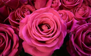
- Associated with the feminine, softness, security and gentleness
- The most calming of all colours, in most shades
- Very strong hot pinks, like red, are best as highlights
- Used for products and services aimed at women
- Especially associated with beauty related products
- Pink is associated with the heart chakra
Blue
Represents trust, loyalty, intelligence and wisdom
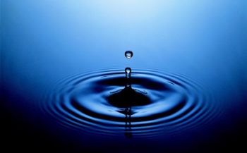
- It is associated with confidence and faith, order and stability
- It’s also associated with communication and the intellect
- Blue is cool and calming, it slows the metabolism
- The most popular colour with the widest appeal and least disliked
- Cool blues can appear cold and uncaring
- Deeper blues have corporate and business associations
- Bright blues and turquoise are good for sports
- Blue is associated with the element of water, the sea and the sky
- Sky blue is the colour of the throat and indigo of the 3rd eye chakras
Green
The colour of nature, growth, healing and harmony
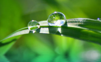
- Green is fresh and calming, it’s pleasing to the senses
- Dark greens appear conservative, dependable and masculine and wealth
- Light greens are calming
- It is also the colour associated with envy – and can be associated with illness
- Used for natural, eco and garden products
- Green is the colour of the element of earth
- It is also the colour of the heart chakra (with pink)
Yellow
Associated with happiness, sunshine and good times
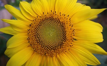
- Generates optimism and laughter and stimulates creativity
- Associated with vitality and speeds the metabolism
- It stimulates serotonin, the “feel good” chemical in the brain
- Golden yellows promise good times
- Some yellows are associated with cowardice
- The most disliked colour among men
- Sky blue or turquoise with yellow is the most popular colour combination
- Can be overpowering, if strong yellows are overused
- Yellow is the colour of the solar plexus chakra
Gold
Represents wealth and prestige
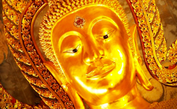
- It is associated with success, achievement and power
- With quality and sophistication
- It conveys prosperity and riches, generosity and extravagance
- It conveys glitz and glamour, as well as tradition
- It is most used for expensive, upmarket products
- Frequently combined with black
- Symbolically it is associated with solar energy and illumination
Orange
Associated with fun, warmth, energy and ambition
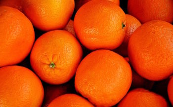
- The most flamboyant colour on the planet!
- It’s associated with enthusiasm, extroverts and freedom
- Like red, too much can overpowering
- It’s good for highlights and calls to action
- Often used for organic products
- Also good for impulse purchase products
- Orange is the colour of the sacral chakra
Purple
For wealth, prosperity, sophistication and spirituality
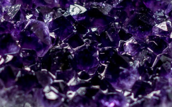
- It is the colour of royalty and of religion
- Also the colour of spirituality, wisdom and mystery
- The most popular colour among teenage girls – they may grow out of it!
- Also the colour that provokes the strongest responses – love it or hate it!
- It’s often used for alternative and spiritual businesses
- It’s also very popular among vets, for some reason!
- Violet is the colour of the crown chakra
Brown
Conveys reliability and strength, honesty and friendship

- It is associated with material security, stability and foundations
- It is reliable, comfortable, warm and down to earth
- The colour of the earth itself, it is associated with nature
- Often used for natural or organic products and services
- Dark browns can be a softer alternative to black
- Too much brown can be dull, even depressing

Colour and Your Website
Colour is the first thing your website visitor will register, deep in their brain.
If it is pleasing to them and congruent with your message, they will stay.
If not, they will go.
If your chosen colours reflect your values and those of your target audience, they will resonate and create connection.
You should choose colours that appeal to you, especially for a personal brand. For your photos it’s helpful to choose colours which complement your colouring.
It’s also important to look at your combination of colours and how they complement each other – some colours work best as highlights. The most popular combination of all is sky blue or turquoise with yellow.
I’ll be covering topics such as contrast and font colours in more detail separately, but meanwhile, be aware that some combinations are easier to read than others – generally dark text on light backgrounds is much easier than the reverse.
If you have any comments or you need any help, please do get in touch.



Leave a Reply